
Magazine/Special Sections
The following collection is from the Special Sections department of the News & Record of Greensboro, NC, and Pinehurst Living / Sand & Pine magazines of Pinehurst, NC.
October / November Pinehurst Living and Sand & Pine
September 2019 pinehurst living magazine
July 2019 sand & Pine and Pinehurst Living magazines
april 2019 sand & pine magazine
march 2019 pinehurst living magazine
February 2019 1808: Greensboro’s Magazine and Sand & Pine
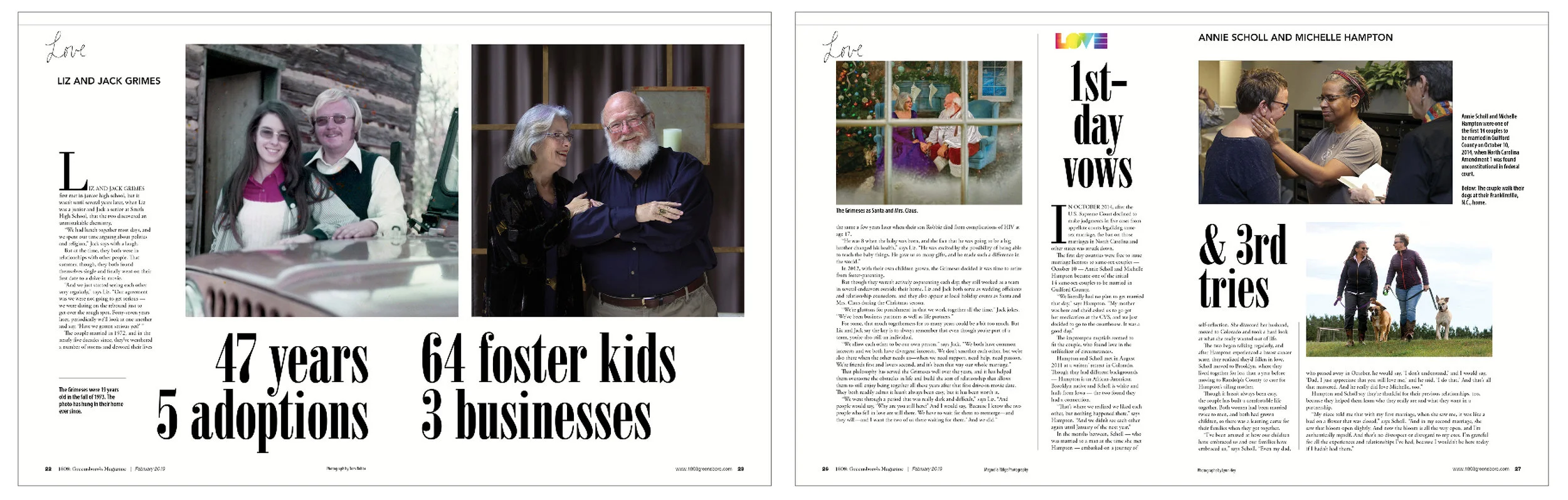
Pairing old and new images with headlines based on numbers led to a consistent feel across the six pages devoted to the “Love” package.
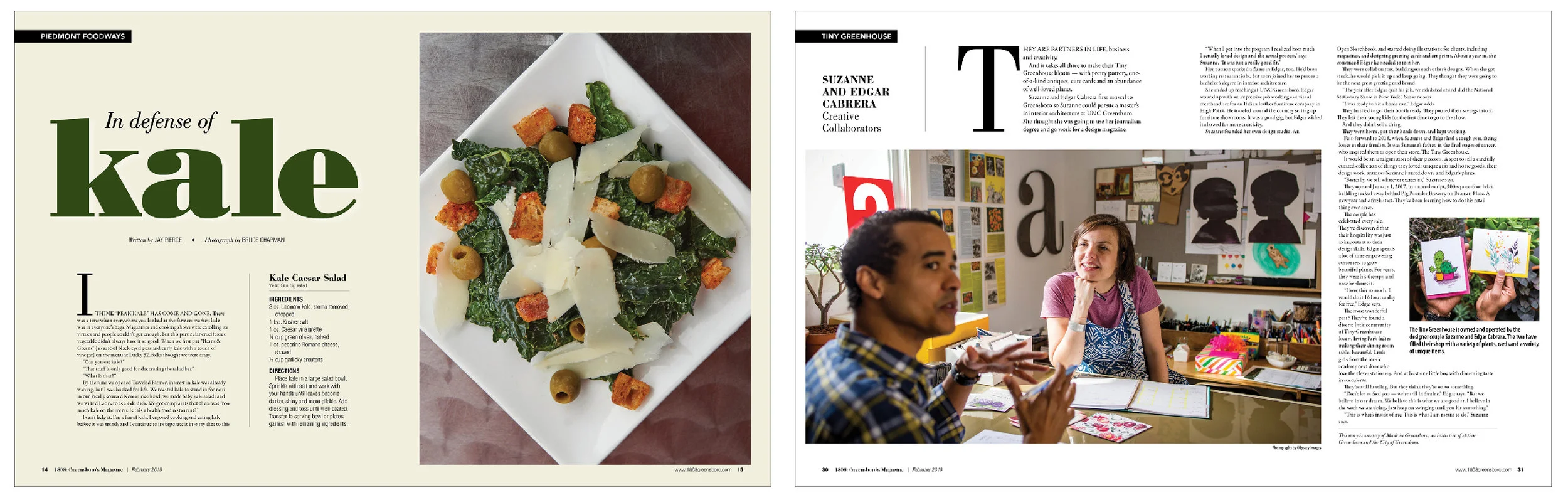
The food columnist talked about his love for kale. A married artist duo was profiled as part of a collaboration with the Made in Greensboro organization.
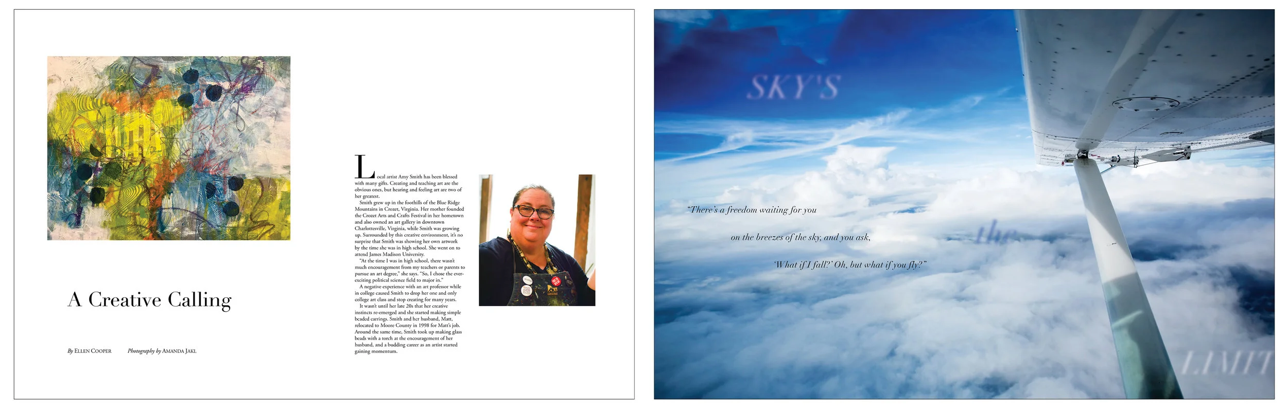
In Sand & Pine, an artist and a flight instruction school were profiled.
JANUARY 2019 1808: GREENSBORO’S MAGAZINe
december 2018 1808:greensboro’s magazine and sand & pine
november 2018 1808: Greensboro’s magazine and pinehurst living
OCTOBER 2018 SAND & PINE AND 1808 MAGAZINES
september 2018 1808 and Pinehurst Living magazines
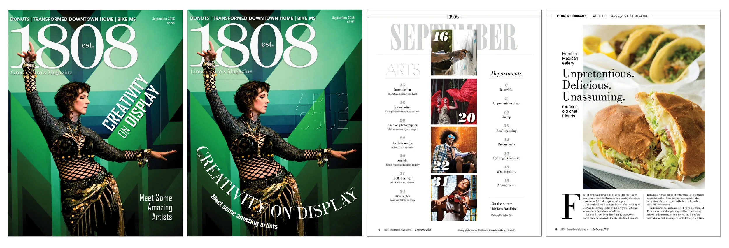
We explored several versions for cover text placement. I suggested following the lines in the photograph, including the arc of the dancer's arms and the diagonals in the background, instead of the initial option's completely level headline (not shown). To me, the unexpectedness and grace of the arc follows mood and content of the issue, while the diagonal text is hard and more straightforward. The left example won the day. I played the index page simple and bold with visuals from the ARTS content. The food columnist's piece on a grocery store-based Mexican diner anchored the food material.
AUGUST 2018 1808: GREENSBORO'S MAGAZINE and Sand & pine
JULY 2018 1808: Greensboro's Magazine
JUNE 2018 1808: Greensboro's magazine and pinehurst living
May 2018 1808: Greensboro's Magazine
discover guilford 2018-19
April 2018 1808:Greensboro's Magazine
MARCH 2018 1808: GREENSBORO'S MAGAZINE
FEBRUARY 2018 1808: GREENSBORO'S MAGAZINE
PROTOTYPE PAGES
A series of experiments on photo usage and white space.
JANUARY 2018 1808:GREENSBORO'S MAGAZINE
DECEMBER 2017 1808: GREENSBORO'S MAGAZINE
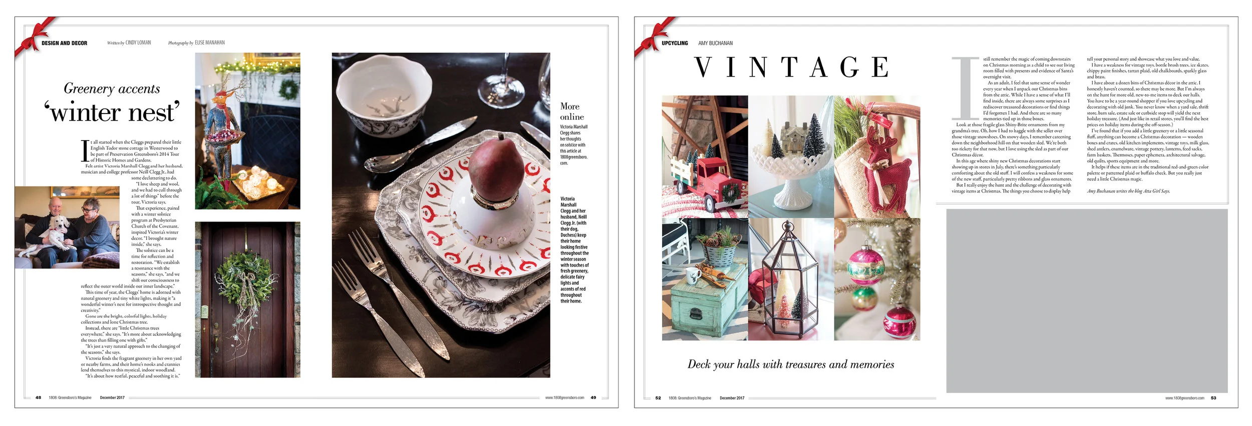
Decorating is an important part of the season. For the left pages, photographs were made in 2016 to be used a year later. A columnist who specializes in "Up Cycling" provided the story/photographs for the right spread. The gray box was filled with an ad.
november 2017 1808: greensboro's magazine
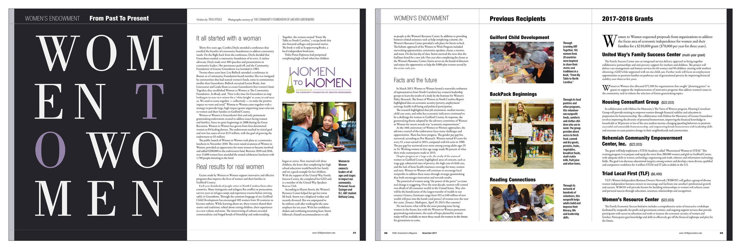
The Women to Women organization provided material about their history, award recipients and past grantees. Minutes before the printer deadline, they requested the inclusion of their logo. I would have gone in a different direction with the main type if that had been outlined earlier.
OCTOBER 2017 1808: GREENSBORO'S MAGAZINE
The battle for guilford's best, 2017
september 2017 1808: Greensboro's Magazine
AUGUST 2017 1808: greensboro's magazine
JULY 2017 1808: GREENSBORO'S MAGAZINE
JUNE 2017 1808: GREENSBORO'S MAGAZINE
May 2017 1808: Greensboro's Magazine
2017-18 Discover guilford
The annual guide to the Greensboro, NC, area.
March 2017 1808: Greensboro's Magazine
February 2017 1808: Greensboro's Magazine
January 2017 1808: Greensboro's Magazine
Greensboro Thrives - Chamber of Commerce magazine
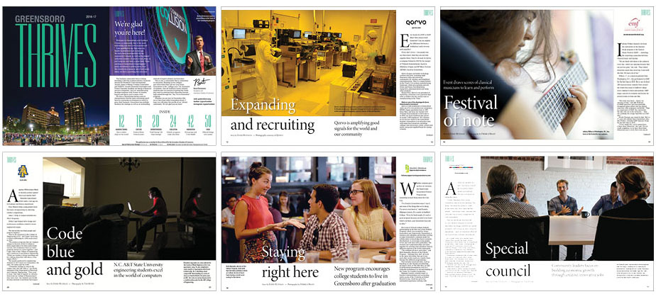
The Greensboro Chamber of Commerce produces an annual guide to the city. I was the Creative Director on the project, coordinating content and communication with the Chamber and handling all design and photo editing. I also photographed several spreads. The end product was markedly different from years past and was exceptionally well received
special section cover / pages
November 2016 1808: Greensboro's Magazine
april 2016 1808: Greensboro's Magazine
Great Escapes, travel-oriented newspaper special section
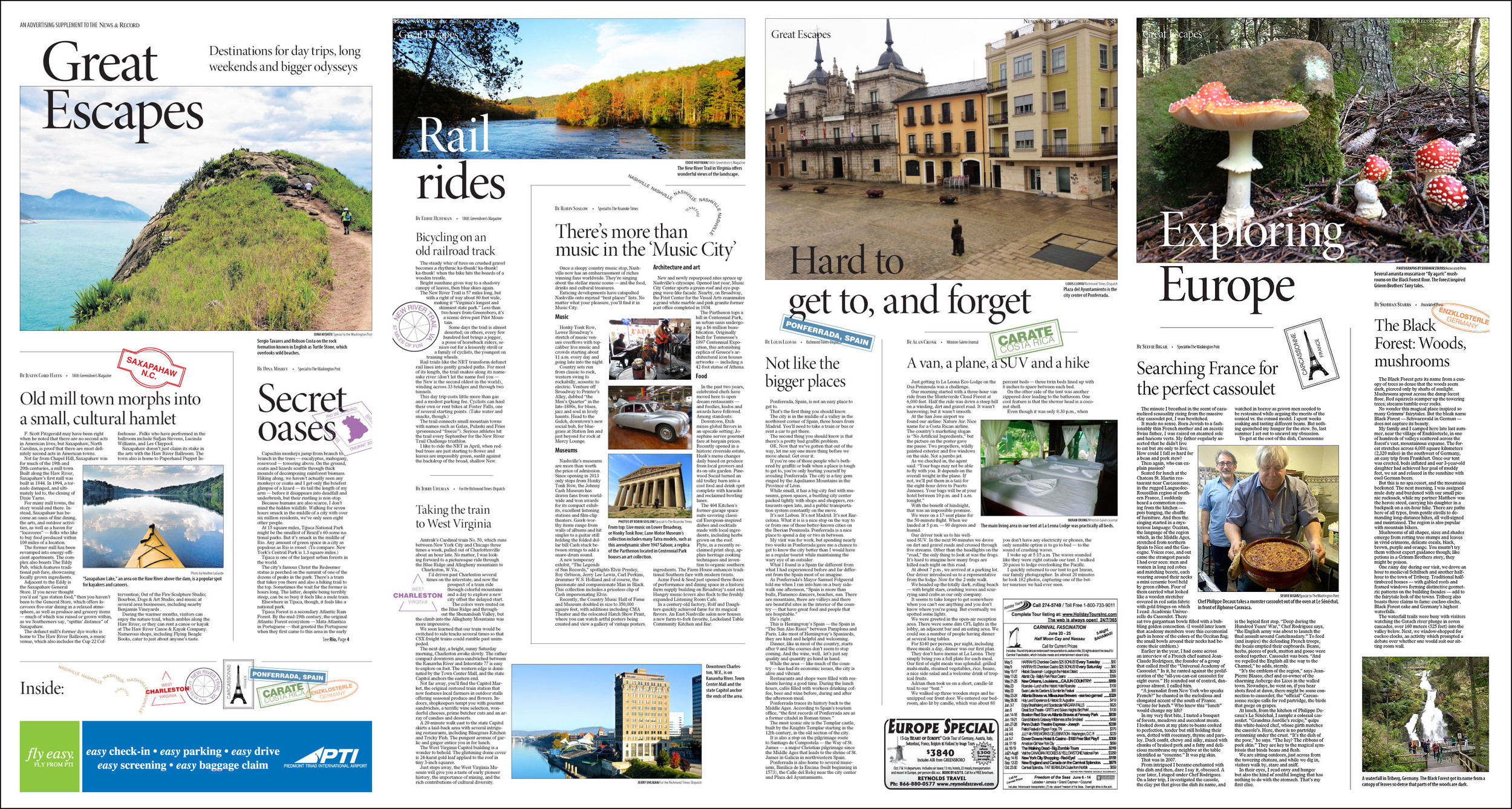
Great Escapes was a travel-oriented, newspaper special section to provide interesting ideas for get-a-ways, near and far. I created all of the "passport stamps" on the fly to bring in a feeling of a far-flung adventure, even if it's Saxapahaw, N.C.